Spirit Odyssey
Spirit Odyssey is a made-up series that focuses on smaller stories of different people in a world of magic. It’s a mix of slice of life, comedy and adventure packed into one. Swirls carvings are symbol of magic, that’s why it’s heavily incorporated in the logo. That’s why it’s heavily important to incorporate that connection into the logo. Another addition to the project is
the art book. The book is an art book that focuses on behind the scenes of the production. From concept art, scrapped ideas of characters or stories, and history throughout the process. Art books for series are unique in their own ways to reflect the show/book they are showcasing. Spirit Odyssey is heavily rooted in the environment.
arget audience is for young adults and animation fans. The series itself is target to a wide range of people, but young adults are its bigger audience as they get into the stories and characters. Young kids can enjoy the fun adventures of it. The art book itself is for enthusiasts who love learning the lore behind the production but also to people who want to learn more about the field.
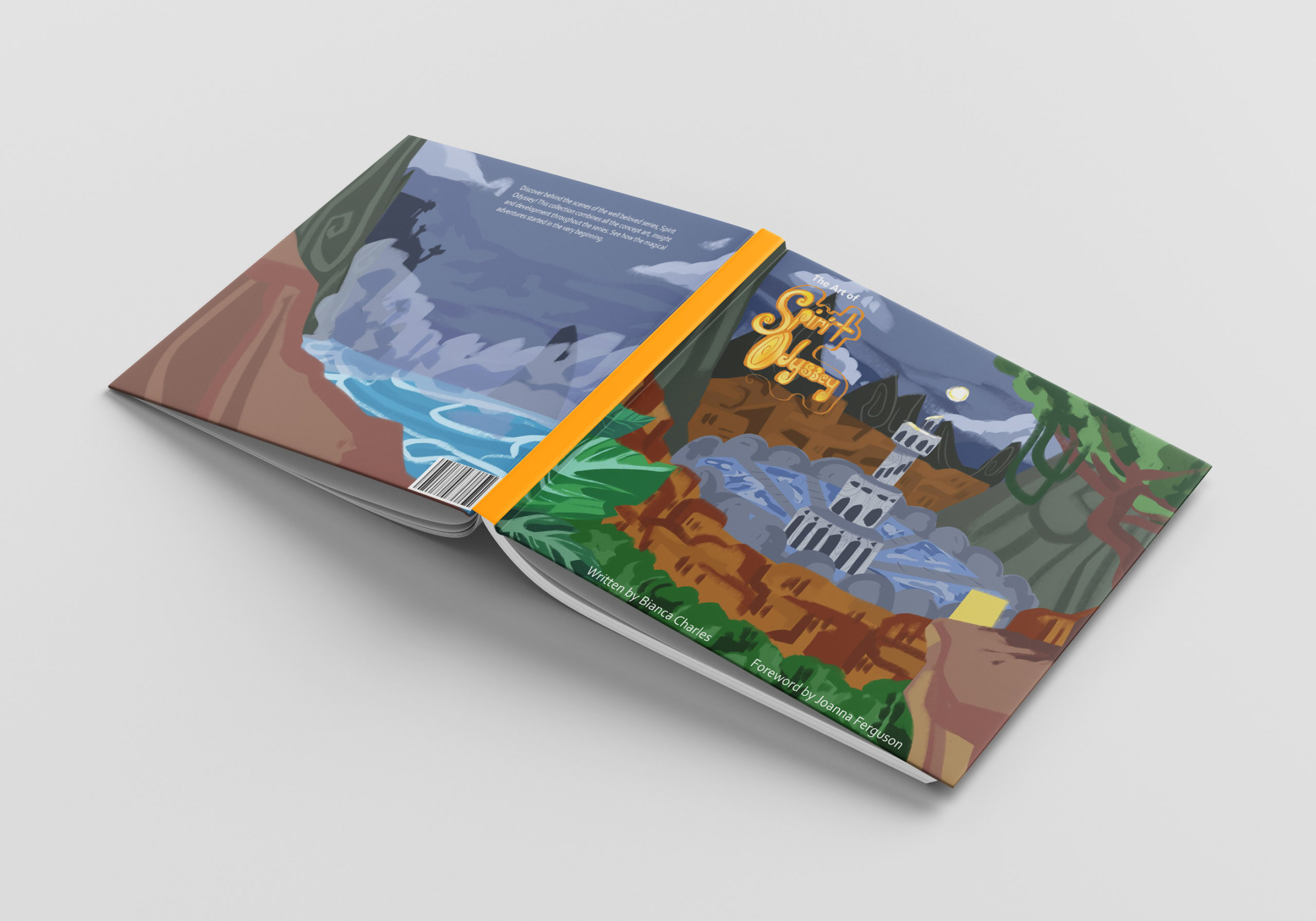
The cover and back represent that heavy important of nature into its design throughout the pages have text that gives a brief description of the subject matter. Examples images and a fun way to present the info but make it readable. The goal was to make a logo for a series that is memorable and represents what the concept is about from the get-go. The art book is a visual showcase wrapped into pages. To make it both visual stunning and being faithful to the styles aesthetic while also still being balanced for readers to read the text. Spirit Odyssey is meant to be differ from other animated shows, so the logo and art book does that to make stand on its own.
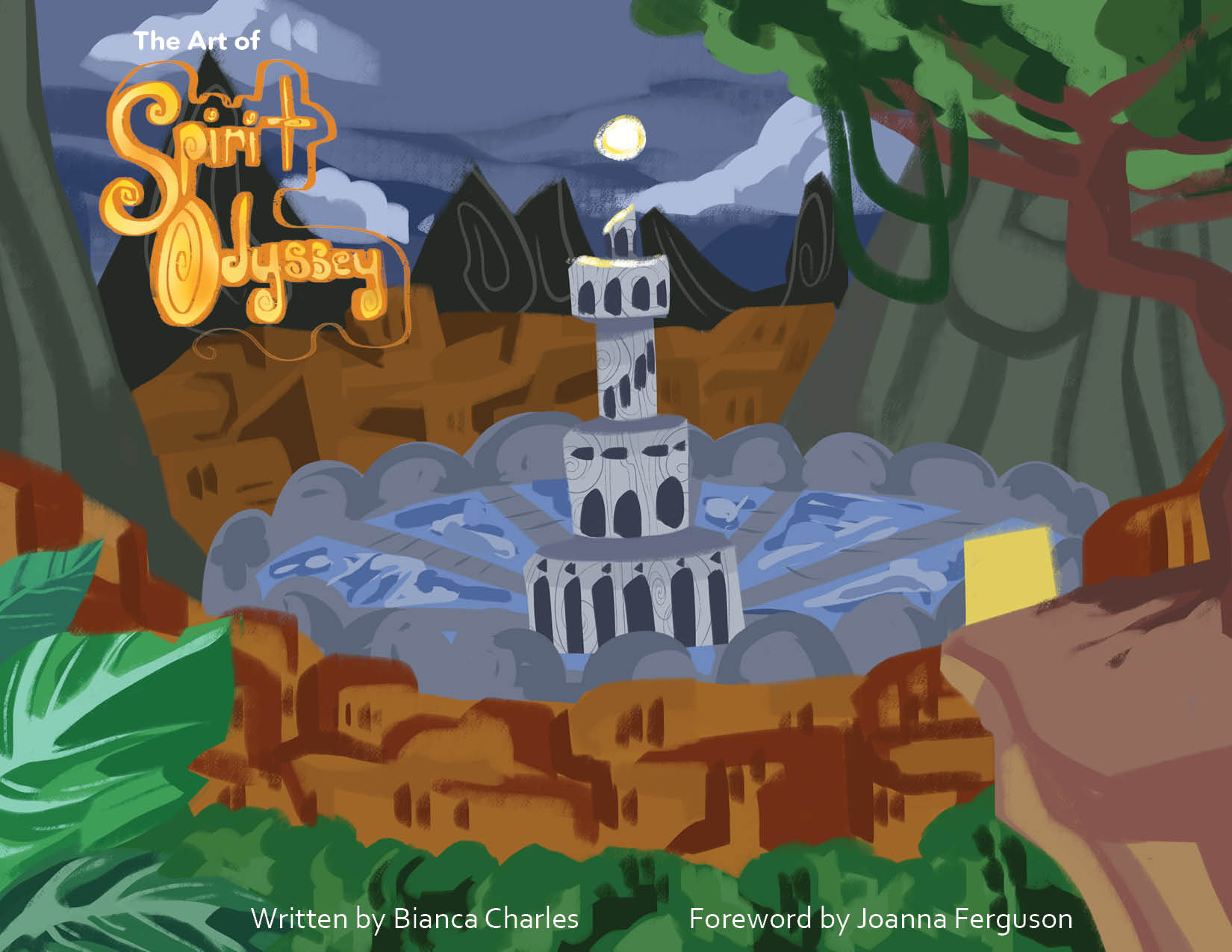
[Front Cover]
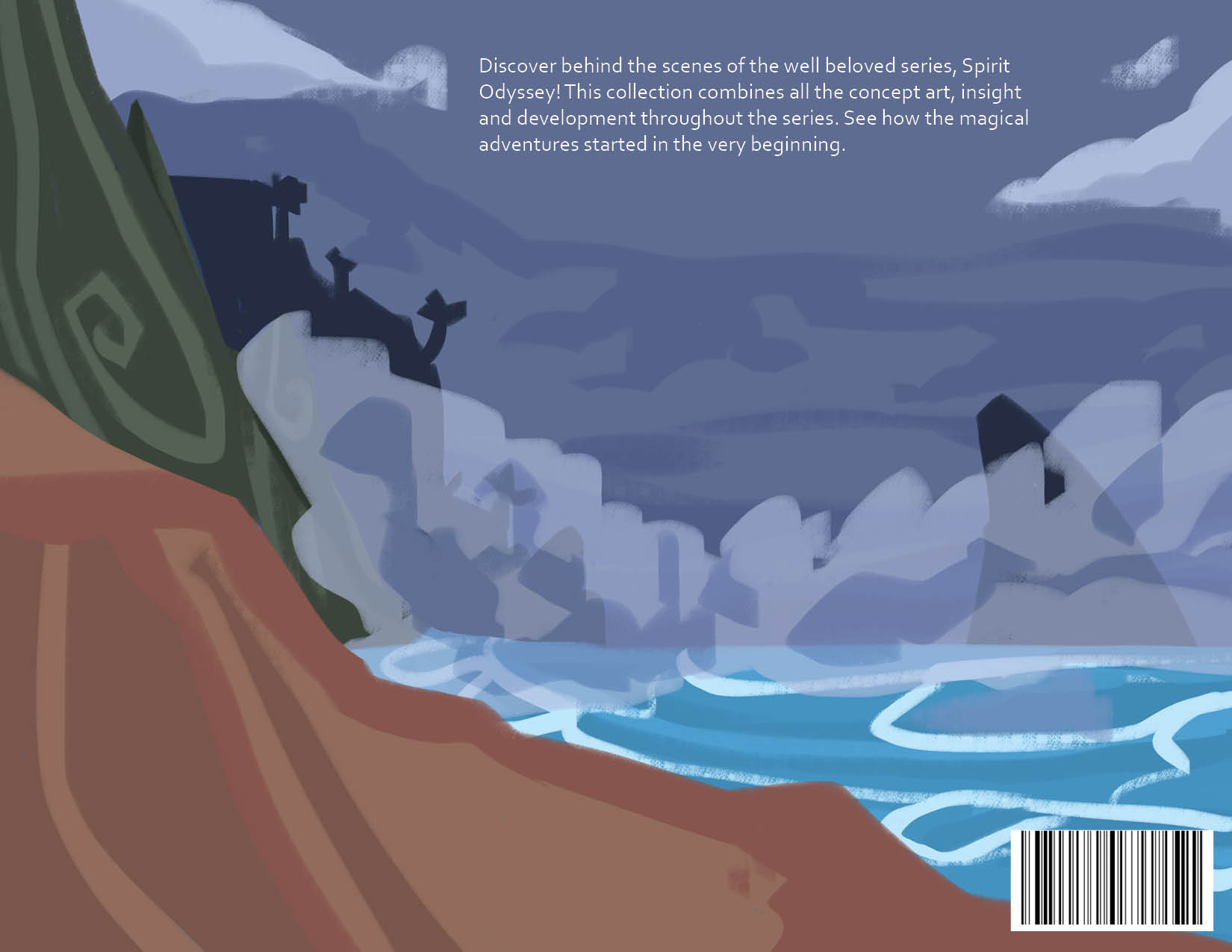
[Back Cover]
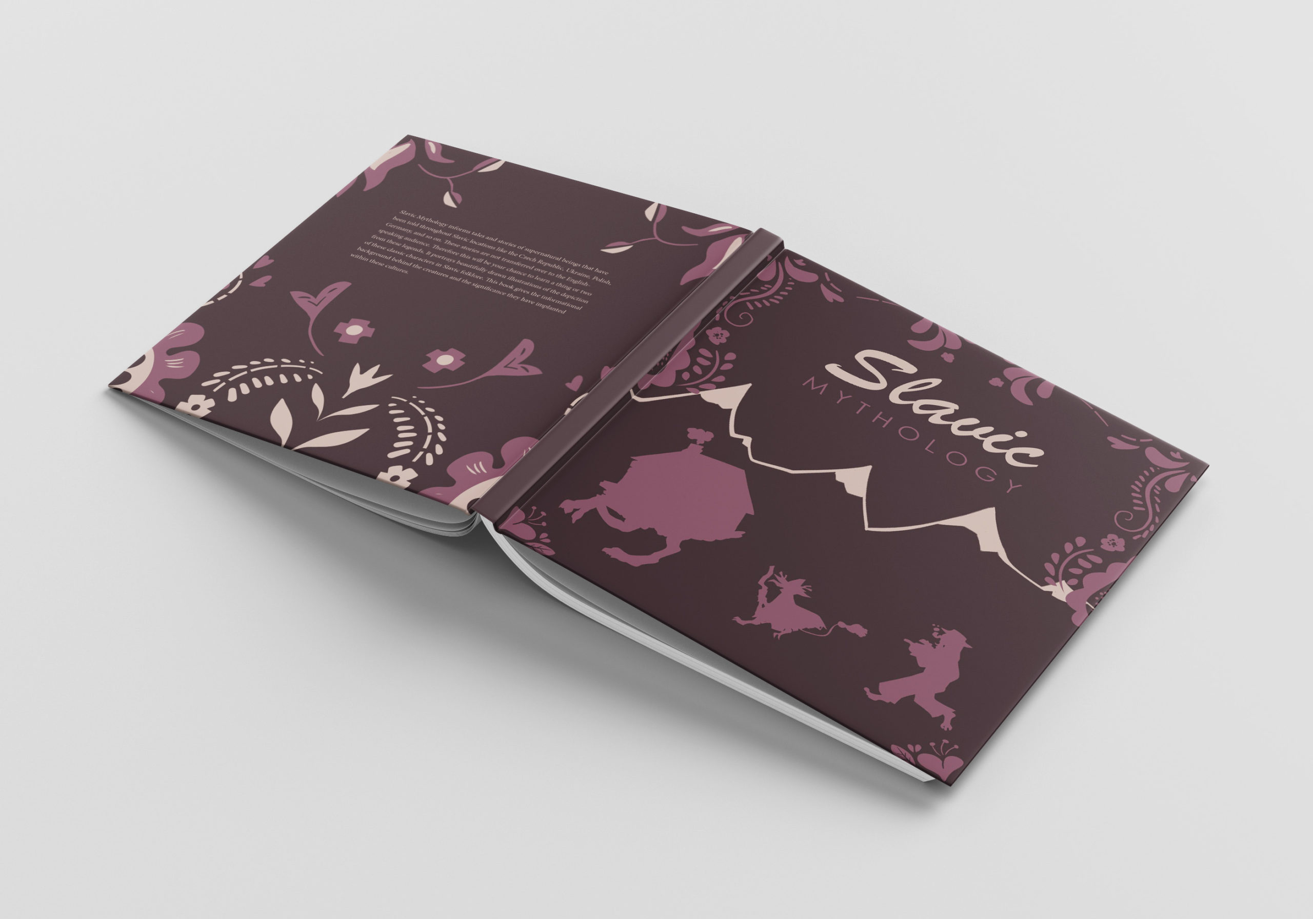
The book cover for the art book of Spirit Odyssey. The front cover takes a concept of what the world can look like. The back is the contiuation of the front as it takes beyond the moutains. It gives people who are fan of this show will get excited to see their fav show before production. Even an audience who doesn’t know much of the show can appreciate the artstyle from a first glance.
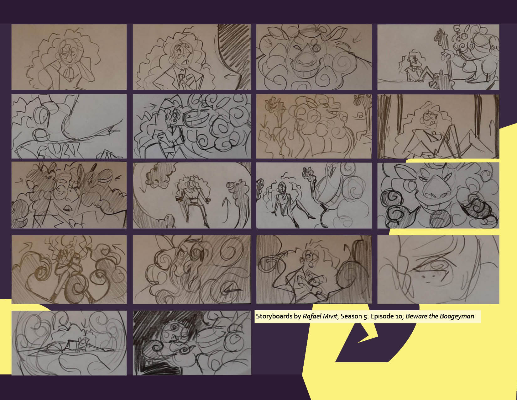
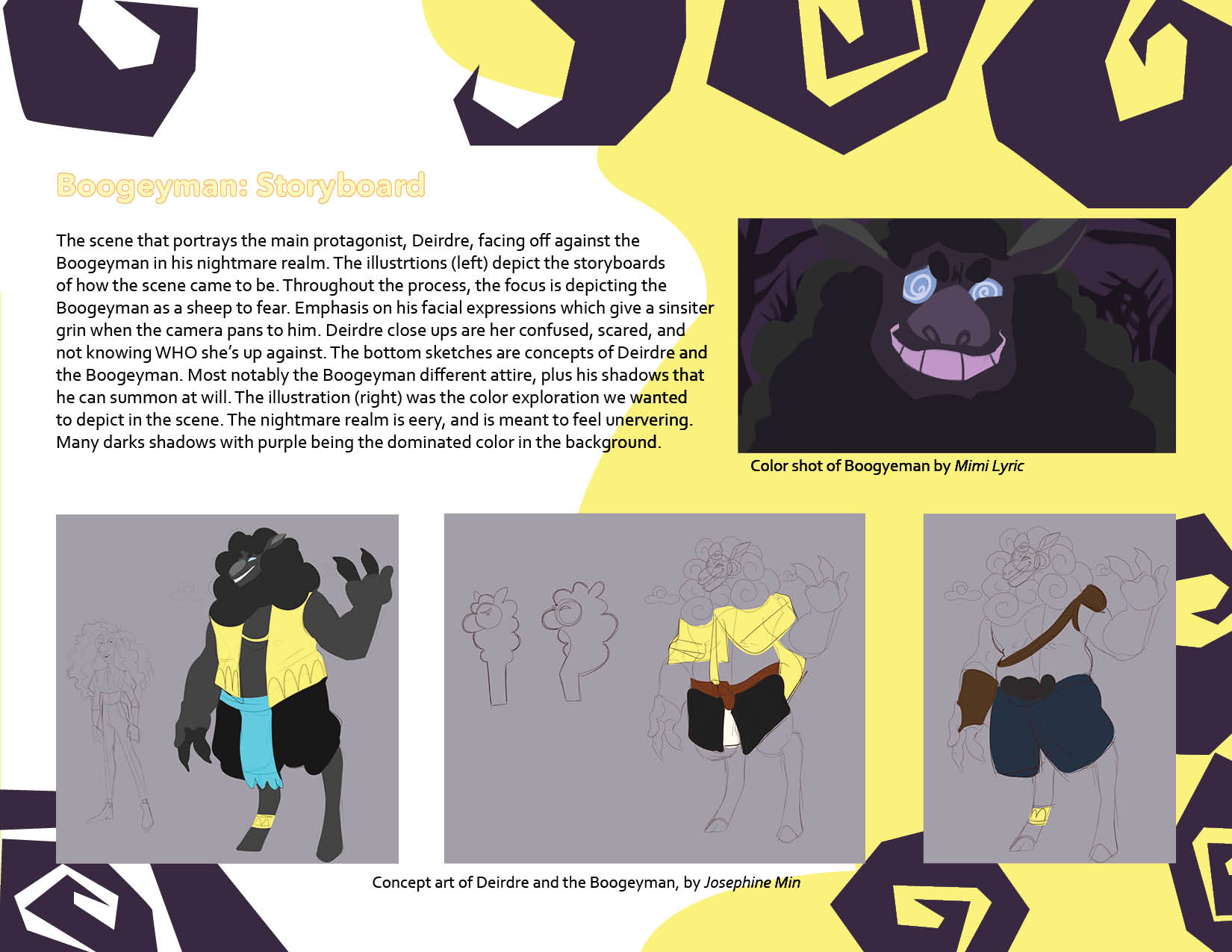
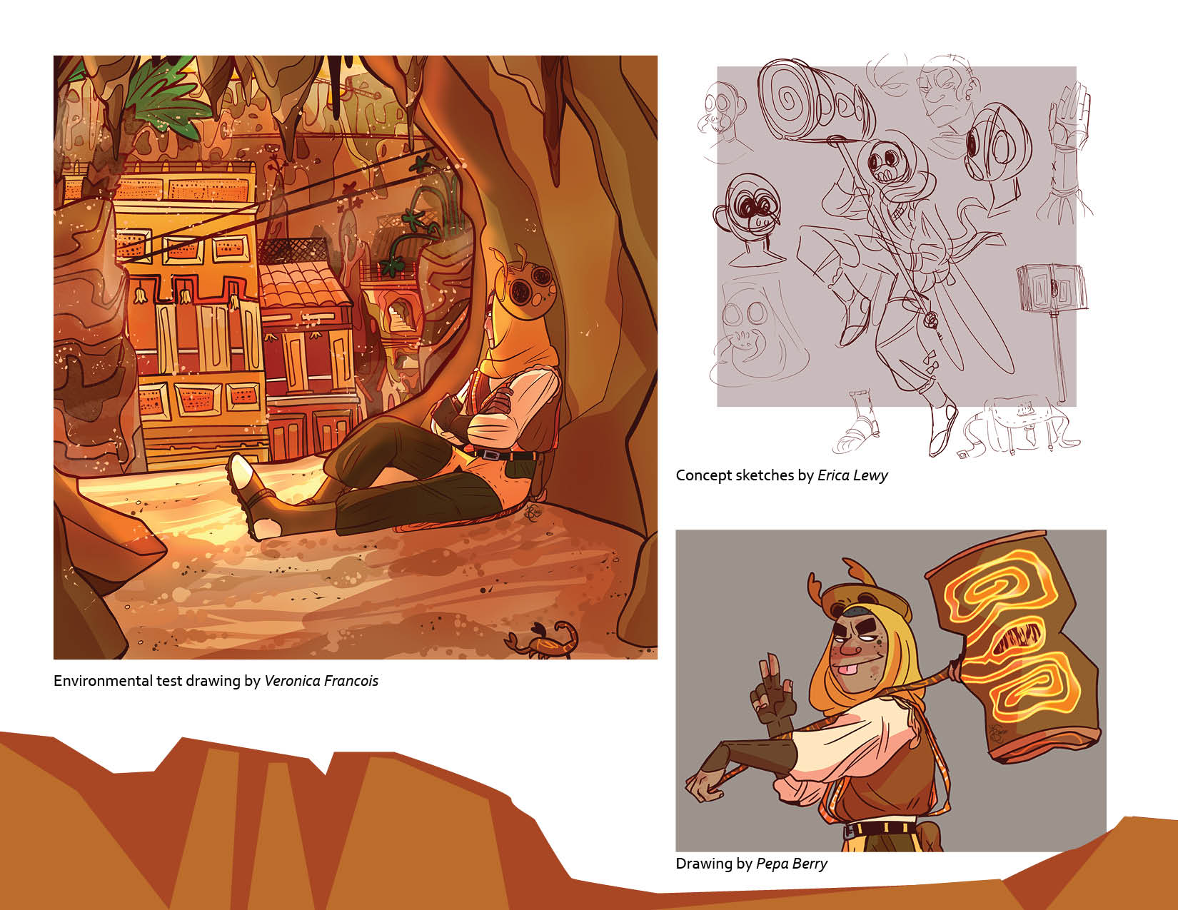
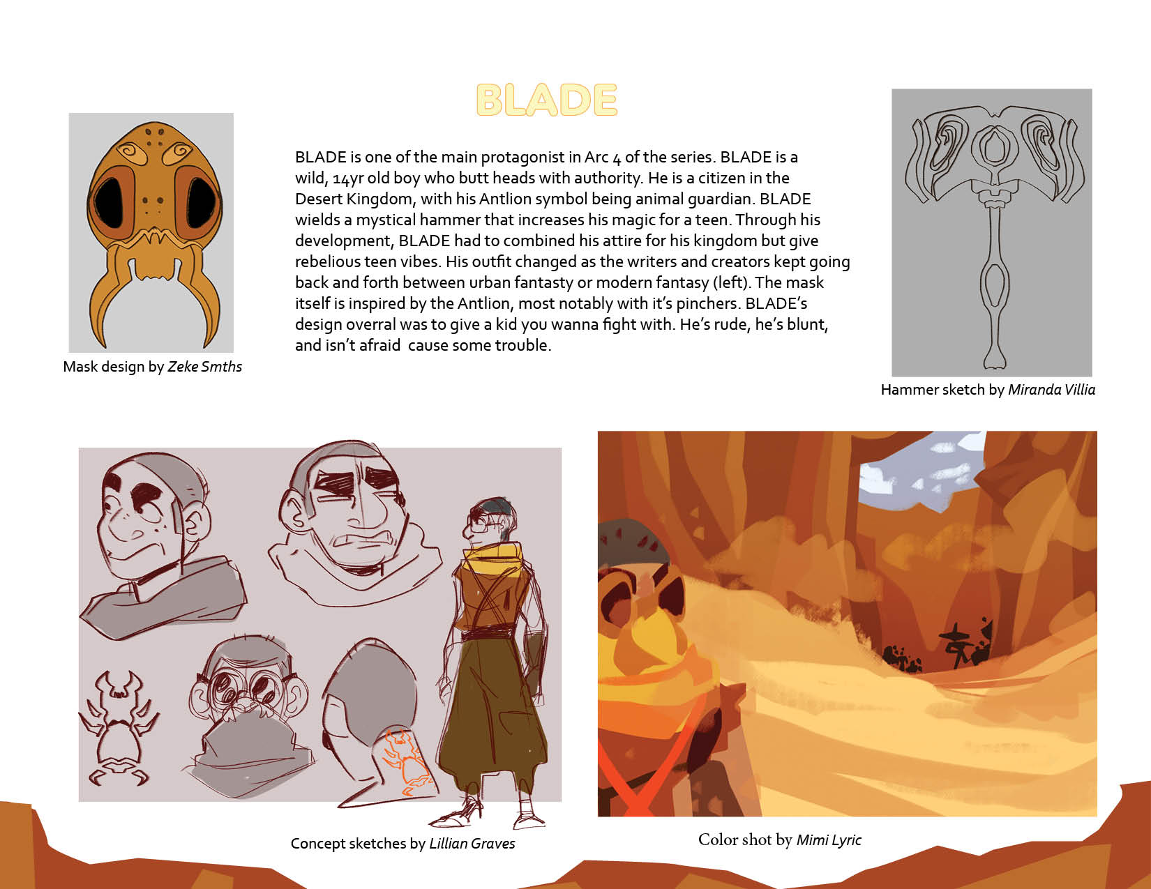
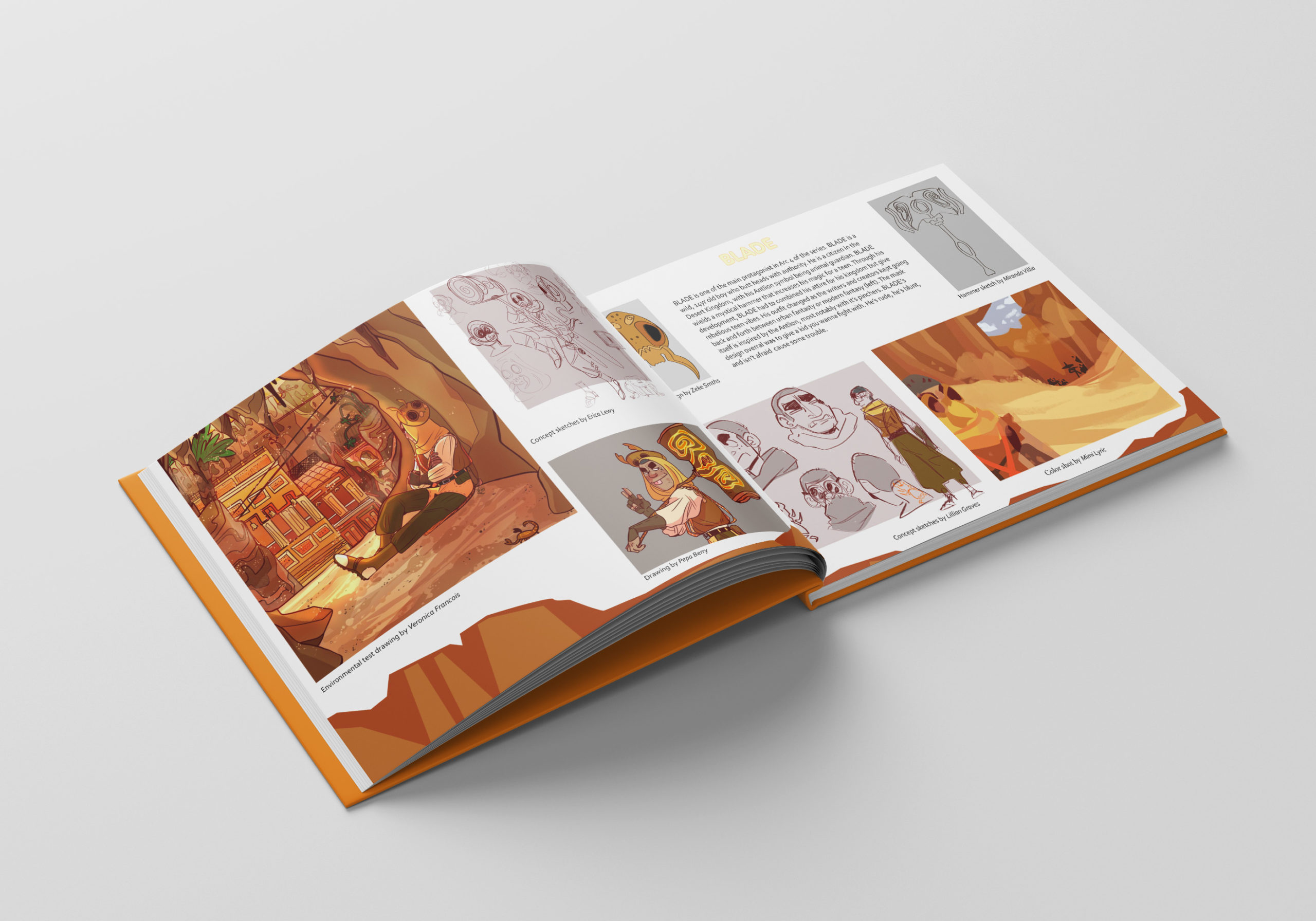
Here are the example pages that gives an outlook of what the pages would look like. They vary from page to page depending on what the sibject matter is. The top having a heavy usage of purples while the bottom pages have a cohesive usage of oranges and yellows that complemant the warm attributes.
